Thursday, November 19, 2009

Three Levels of Design

Nathan Schedroff brought out in his lecture What is the Place of Design in Our Society?-Sustainability", how a more sustainable and meaningful world is in our grip. He mentioned how the "slow food" movement builds upon a relationship between a person and their meal. He further suggests that we think about how the food came to be on our plate, where it came from, and how far it traveled? This form of sustainable thinking can be implemented into sustainable design: designing products that make tomorrow better for everyone.

Schedroff stressed that sustainability should not only be pigeon-holed to "green" thinking and recycling. In fact, in order to sustain this earth, society needs to take into consideration financial, social, and ecological aspects. This approach on design thinking effectively fabricated an ideology of taking care of our future. Designing for usability, accessibility, dematerialization, reuse, disassembly, recyclability, and so on, humans would have the power to transform society's incessant need to extract precious and depleting resources.

Wednesday, November 18, 2009

Objectified

Photo Courtesy of: http://www.objectifiedfilm.com/

Gary Hustwit's film "Objectified" highlighted the importance of looking at how form expresses itself through the object, either artistically, through symbolism, function, etc. One designer commented that designers today should "become cultural generators... intellectuals of the future". The general consensus of the designers featured in the film was that of simplicity, a "moving forward" attitude, and ingenuity. It can be said that people want to see how a product would fit into their lives- the human-object relationship, therefore, demands a personal expression of form. Because consumers project themselves on products, i.e. we often project ourselves in a space and imagine how it will impact our lives, design should be "useful, simple, unobtrusive, understandable, and as little design as possible"- mentioned one German designer.

Many people feel like a product should work and perform for them. For example, Apple's iPod does all the work for users by playing music, storing data, connecting to the internet, etc. Most importantly, Hustwit stressed the idea about how design should be doing something that is contributive. Karim Rashid commented on society's current issue- "are the things we are doing really making an effect and making change?" Rashid emphasized the importance of adapting to society's needs, and the need to identify with today's digital age. People change and design too should move forward with an advancing society.

If Mac Ruled the World

Pc Mac Apple Leopard Os Desktop
Photo Courtesy of: http://www.macwallpapers.eu/wallpaper/Pc-Mac-Apple-Leopard-Os-Desktop/

In your pocket. In your neighbor's pocket. Two tiny white modules connect you to your personal transportable library. A 24" screen fits beautifully atop your desk. Thin as air. The latest iPod, Macbook, and iMac are just a few Apple products that fit these descriptions. A sleek, hip, simple design describes today's zeitgeist of modernity and a technologically forward society.

The Apple company has been critically acclaimed for it's ingenuity in technological products. If you watch television, listen to NPR, any radio for that matter, read a newspaper, magazine, or talk to people, you would know what the latest Apple gadget or newest generation of iPhone is. Jokingly, one does not even have to have contact with the outside world to know that the newest iPod is now an iTouch. Almost everyone is turning Mac- Apple is slowly taking over the world one Mac virgin at a time. Many buy into this company for it's high-performance products. However, from a designer's perspective each product is beautifully crafted, also helping society keep up with today's digital age.
There are so many convenient factors that you inherit once you "turn" Mac. For instance, no need to carry around your outdated, bulky, "portable" CD player and large case of CDs. Even better, you can carry the World Wide Web, an entire music library, and a personal agenda around in your pocket- all in one device! Apple's slimming design behind every computer and portable mp3 player is befitting to today's digital age: less is more.

Barbie Nation

Photo Courtesy of: http://www.barbiedressup.info/


All of my friends had one. She came with so many different outfits, purses, shoes, and she even had her own dream house. When I was four years old I remember unwrapping the shiny pink box to my white blonde Barbie. It was the center of many of my play dates. We would dress her up, plan out her day, and take her on romantic dates with Ken in her luxurious pink convertible. Little girls dream of attaining everything that Barbie has. She has every material possession possible, she's classy, has the perfect boyfriend, loyal friends, and of course the perfectly proportioned, slim body. And what more reason to want to be Barbie because she can be anything she wants- she's a doctor, race car driver, and flight attendant all in one day.


Just standing a little under one foot tall, little girls have been able to live vicariously through this plastic object as a "grown up" without having to step a foot outside the door. Everything about barbie, her face, figure, form, house, family, etc., is universal. Hence, every girl can play Barbie. As a result, Barbie has become a social icon and if there was perfection in a woman's physical appearance, Barbie would be the standard.


Visually and mathematically, Barbie's body was designed to be perfectly proportioned and symmetrical. From this seemingly innocent play doll, ideologies have adhered to Barbie longer than have her plastic high heels (which cannot stay on longer than a few minutes). Barbie has become a focal icon on what can be considered the American Dream signified by her picturesque lifestyle. In a Mattel advertisement, Barbie is shown alongside a beautiful house that has a white picket fence. Her driveway wraps around her large yard and there is a dog and a personal dog house in front. Peering through the window and into the house, one can catch a glimpse of her life: a three-story house equipped with every type of room imaginable, a three car garage, and her main car- a pink convertible with her boyfriend, Ken, in the passenger's seat. A materialistic American Dream is epitomized in this one advertisement alone and an iconic figure is fashioned into the very soul of society. What Matell designers are signifying through Barbie's universality is this: Barbie can have everything. There are no limits on the possessions she owns. Yes, you can be Barbie.

Wednesday, November 4, 2009

"Reinvent Wheel? Blue Room. Defusing a Bomb? Red Room."

See full size image
See full size image

In a color study done earlier this year, scientists and anthropologists marveled at the results they discovered. "Reinvent Wheel? Blue Room. Defusing a Bomb? Red Room." This New York Times article discusses the exploration of human interaction with color in the aforementioned study. Experiments dealt with revealing the relationships behind the colors red and blue and how individuals interacted cognitively when approached with situations involving either color. What these numerous tests revealed was first and foremost the emotion assigned to each color and how certain situations moved individuals to react cognitively. For example, a test was conducted to see whether or not cognitive performance varied when participants saw the color red or blue. Results determined that "red groups did better on tests of recall and attention to detail, like remembering words or checking spelling and punctuation. Blue groups did better on tests requiring imagination, like inventing creative uses for a brick or creating toys from shapes." The article suggests:

"Experts say colors may affect cognitive performance because of the moods they engender."

So, how is this information useful and important to the world of design? When it comes to color choice, designers, artists, and the like, usually think about how intensity, hue, and tonality will shape the relationship between product and user. Many people don't realize how much thought is put into this part of the process in designing a product, or even painting a room. Color choice is not just thinking about what is or is not aesthetically pleasing. Most often, certain hues are chosen to convey or fuel moods in audiences and their relationship with the color(s) at hand- sometimes even moving people to make decisions subconsciously.

Designers in an array of fields can use color to their advantage. Apparently, color has potential power to control situations, make decisions, and speak emotion. A seemingly elementary aspect of life, color choice is arguably one of the most crucial decision for designers. Decisions are usually based on an emotion, and if color can persuade certain emotions within people, then designers have the upper hand on what a product can do for the consumer. The fact that humans attribute emotion, even value, to colors is ample proof to consider appropriate colors in a given situation.

Article found on:
http://www.nytimes.com/2009/02/06/science/06color.html

Sunday, November 1, 2009

Medvedev's Branches

MEDV1421C
Photo Courtesie of: Franklin Bowles Gallery


Igor Medvedev's work is so fresh to me as a student, that I'm inspired once again to write about his work on display at the Franklin Bowles Gallery in San Francisco. One of the collections, titled Through the Branches, renders the baobab tree in an African desert setting. The baobab has been called the "up side down" tree because the branches resemble a complex system of roots. Medvedev's illustration of the baobab tree is an exploration of the mysterious and bizarre quality of the seemingly unknown natural world. Because the human eyes is not often exposed to seeing what lies beneath the surface of the earth, the baobab opens a door to one of nature's enigmatic creations.

Thursday, October 29, 2009

"Piano Keys"

"The needle is the woman's plow" read the description at the entrance of the exhibit African American Quilts. The collections of Sandra McPherson and Avis Collins Robinson artfully color the pale-gray walls of the Nelson Gallery, each commanding large sections from ceiling to floor like a grandiose waterfall. African American women in the 20th century used to work long hours plowing fields in an area usually dominated by men. Moreover, African American women were soon able to exhibit aesthetic expression through their beautifully sewn quilts- a craft where the "needle" became their "plow". Each quilt seemed as though to have a story to tell- the life it lived, the family it kept warm, and the places it traveled.

"Piano Keys", by Avis Collins Robinson, instantly caught my eye with its stream-like downward pattern. Piano keys, represented by elongated vertical rectangles flow down the canvas like interlocking bricks. The repetition of alternation "keys" lends to a gentle rhythm like that of a peaceful stream, despite its seemingly rigid structure of repeated rectangles. Even though there are no soft or round edges, the quilt's pattern and vibrating colors draw the eye in a rapid, yet gentle, motion from top to bottom and back up.

Tuesday, October 27, 2009

Emerald Reflection

MEDV1456C
Photo Courtesy of: Franklin Bowles Gallery

A recent trip to San Francisco left me in awe from the vibrant city life to the medley of art and architecture that fills the city's streets. Wandering the streets I stubled across a few art galleries, one of which featured Igor Medvedev. I had never before heard of this artist, but the use of bold, bright, contrasting colors and values made me want ot waltz right on in. Half of medvedev's work displayed a motif of large trees with multiple layers of branches filling up the entire canvas. Most of these paintings employed high contrast values with deep, dark colored trees against an orange illuminated sunset.

I was most intrigued, however, by the paintings of sailboats. The detail in water to depict movement is astounding. "Emerald Reflection" shows a brilliant blue and red coral sailboat wading in shallow water. The light value on the surface of the sailboat reveals details in the woodwork, like crevices and shadows formed by the inner structural frame. The subtle ripples, seen through the wavy lines and reflective light on the surface of the water, gives viewers the illusion that the sailboat is wading back and forth just ever so slightly. Not much action is taking place, but the composition seeks to depict a smooth, or legato, rhythmic motion- evoking a peaceful and calm scene.

Sunday, October 25, 2009

Type Is Image

Image courtesy of: alexbinetti.wordpress.com


Swiftly clicking through typographic art on the web, I stopped to look at this composition. It struck my interest because of the contrasting ground and figure. I'm interested in how type is used as image and here, type is used to illustrate an image of a face- something I have never before seen. The enlarged letters in the foreground are what first command attention and melodically carry the eye through the composition to find a distinct figure amongst the collection of letters. What is most interesting here is that the figure of a face is not directly drawn with lines, but what the eye sees are groups of letters that create lines- the result is that we can easily see a figure of a face against a stark white background. The artist's choice of typeface, Times New Roman, in no way deviates from the design of the composition. The universality of the typeface allows viewers to be familiar with it and concentrate on the design of the entire piece.

Binetti comments: "typographic art does not have to involve straight lines of text, it can be made up of jumbles of different sizes, fonts and angles." Binetti's composition clearly conveys this message. The use of typography as an art form- overlapping layers of serifs, cap heights, ascenders, descenders, etc.-creates interlocking patterns for the viewer to discern. In this unconventional approach towards typographic art, Binetti's piece employs visual creativity: the viewer must capture unity. In other words, the figure is not directly "spelled-out".

Friday, October 23, 2009

A Unified Composition

Photo: Adrian Taylor/ Starwood Hotels; hotelchatter.com


Frank Gehry, a world-renowned architect, created the beautifully sculpted Hotel Marquis de Riscal shown above. Gehry's design employs rhythm in an otherwise stiff-like appearance of titanium sheets. He gives a whole new meaning to form: the curves and bends in the roof contrast the rigid structure of the building hidden underneath. There is a play on architectural styles here between the modernity of the actual building and the deconstructive form of the roof. At first glance, a viewer may only see a pile of folded metal sheets stacked on top of each other. After examining and digesting its form, one can find unity in the interlocking pattern of the folds. It now looks like several layers of ribbon are being held together at the peak, naturally descending, allowing gravity to command it's form. The overflowing structure of the roof seems to reach out of the building, as if the origin of this structure starts from the center, where it is unified, and reaches out like giant arms protecting the inner core. Gehry has created layers upon layers of shapes and lines, allowing the eye to travel from the center to the outer edges of any one of the many curvilinear "ribbons". Frank Gehry celebrates the diversity of architecture and design through his thought-provoking designs- Hotel Marquis de Riscal just being one of many.

Thursday, October 22, 2009

A New Way of Thinking

Photo Courtesy of: The MIT Press


Wednesday October 21st, 2009: Geoffrey Chase visits the UC Davis Campus.

The UC Davis Design lecture series welcomed Geoffrey Chase, co-author of "Sustainability on Campus- Stories and Strategies for change". His lecture, based off of the book, highlighted the importance on integrating the environment into the curriculum and the community. "Sustainability is local. Sustainability is global. Sustainability is community."- read one of his slides. Chase's presentation on "strategies for change" focused on starting in the class room. He opened new doors of opportunities on changing the way UC Davis could implement "greenness" on campus and into the curriculum. With this in mind, UC Davis could potentially emerge as a campus for sustainability in higher education- given the fact that it would take the university, staff, and students to make this change possible. Chase mentioned that currently, there is only one campus in the United States that offers a disciplinary major and graduate education in sustainability. So, there is intensive work ahead.

Sustainability is a new way of thinking. This thought kept resonating in my mind as I thought about how I could enhance my education and future career. UC Davis is already one of the leading campuses on making changes to better the environment- almost everyone bikes, there is a highly effective recycling program, a highly environmentally friendly water treatment facility, a dairy farm, vineyard, and olive factory, all handled with the greatest regard for the environment and the community. There are even several emerging classes on sustainability specifically. As a student in the world of design, I cannot help but become influenced by my surroundings-especially the ones that effect me personally. Sustainability and eco-consciousness is sweeping across campus, and what better source is there to be influenced by than the environment? Therefore, if we have control, it is vital to keep nourishing, not destroying, our only natural source of inspiration.

Wednesday, October 14, 2009

The Future of Architects

Photo courtesy of: www.treehugger.com


When a new idea is introduced into mass marketing, the subject itself is often questioned. Why succumb to the low depths of feeding yourself mass information? There is always a catch, but usually a lesson also to be learned. Take for example modern approaches in architecture, engineering, and design. Recently, professionals in many fields have decided to “go green”. However, do we know what it means to “go green”? What is green engineering?


Many have attempted to answer this question and without fail, the varying definitions of green engineering have always come down to one strong point- sustain the environment that humans thrive off of. So, how does green engineering have anything to do with design? The very aspect of green engineering, that is, designing systems to sustain the needs of people and the environment has much to do with design. Written by architect William McDonough, Cradle to Cradle features a more non-traditional approach towards "green" and sustainable engineering. His book emphasizes the importance of creativity in ways that we can use nature as our model in designing our own sustainable systems. McDonough suggests: “in nature, waste equals food”. In other words, humans should celebrate the diversity of nature and resources we have available from it. For example, we can implement nature’s own designs by using current solar income, such as natural energy flows. Designing homes with carefully placed windows, efficient floor plans to take advantage of daylight, and architectural designs suited to the region can be taken into consideration in maximizing sustainable gain.


Carefully taking advantage of the diversity of nature and using it as a model is key in green and sustainable design. As mentioned before, sustainability is the future of architecture. Designers must move forward in order to meet the demands of today's concurrent design trends and ideology of social responsability. Here is the future of architects: design by green and sustainable standards.

Live in the Future of Architecture Now

A relatively recent movement in architecture has been to change the way buildings are designed to adapt to and maximize use of natural energy flows. Integrating natural and renewable materials and designs have becoming increasingly significant as architects strive to meet the modernity of today's movements in "green" and sustainable design (a subject that requires a different post, but for the sake of the current subject at hand, "green" and sustainable design can be quickly referred to as an environmentally friendly approach to design). At any rate, sustainability has been referred to as "the future of architecture". Well, the future is now. Architects are heavily adapting methods of sustainability into the designs of their infrastructure. For example, the book Sustainable Homes, written by Jacobo Krauel, synthesizes the reduce, reuse, recycle objectives into several thought-provoking ideas. The emphasis is on innovative ideas, new technologies, and more efficient energy systems. By adapting to modern advancements in science, design does not only have to be a topic of aesthetics but also of meeting the needs of people and the environment in which we live in.

Below are examples from the book Sustainable Homes. The top picture is of a cabin designed in the underbrush, perched on a low bank at the waters edge near Deception Pass on the Swinomish Indian reservation. Its structure is built around eight concrete disks that narrowly avoid the 100 ft tall fir trees and their roots while isolating the impact of the house on the complex top soil layer to ensure continued tree health. Large monitors poke out of the roof and draw light from about through the fir canopy, providing strong passive ventilation that is augmented by a giant industrial ceiling fan, which can be used to either slowly adjust heat or quickly make an air change. Environmentally conscious and an aesthetically pleasing, one can live beautifully in the wild while feeling good about not destroying the natural habitat. The future of architecture is our present.
-courtesy of Sustainable Homes, Jacobo Krauel

"The Significance of Nothingness"

Cy Twombly- Cycles and Seasons
Photo courtesy of: www.artcritical.com

White space. When most people think about it, there is no particular emotion. It's there, it's not there. I recently read a book by David Sedaris titled "Me Talk Pretty One Day" where he analyzes this idea of white space. He comments: "these people (designers) are discussing the significance of nothingness." Some would argue that the only people who care to discuss the importance of white space are designers and art talented individuals- the mass population could care less. However, the importance of white space can be seen in all aspects of design in modern day to serve the need of a fast paced, short and sweet message.
The phrase "less is more" seems appropriate in today's world of design and advertisement. This minimalist approach with the use of white space in modern day design can be seen in Cy Twombly's Cycles and Seasons. The use of white space allows for a shift in visual weight from the upper right hand corner down to the lower left hand corner. Because of the white space, there is a significant start and end point- the negative space allows viewers to focus on the "heavy weighted" segment of the painting. The white space also adds a creative contrast to the swift, dramatic, and smudged markings that fill up the center of the page, giving the painting a playful quality and organic texture. Consequently, there is much to be said about "nothingness".

Paula Scher

Photo courtesy of: mockduck.wordpress.com


A New York City designer, Paula Scher has been touted as one of the top designers in the city. Scher has helped create identities for famous companies like NYC Ballet Co., Public Theatre Co., Citi Bank, Tiffany Co. and many more. She draws inspiration from the loud, urban, industrial city of New York. In a short video clip, Scher mentions that she "heavily works on instinct" and rarely works on refining because if her ideas don't come instantly, they almost always don't end up working for her. This aspect of relying heavily on instinct is drawn and inspired by the fast-paced city life in the movement of New Yorks' "hustle-and-bustle" life style. The way she works, her "pass/fail" attitude, is a strong commentary on the way many designers work. So many designers beat their heads trying to figure out what their client's want, when it is the responsibility of the designer to determine what the client really needs. Of course, meeting the clients' expectations is important, however, it shouldn't be at the expense of undermining your design expertise. Scher's work can be appreciated for it's clever and respectful use of simplicity.

Venture to Pence Gallery

Leslie Show- Karen (Black Bile)

I recently meandered around the Pence Gallery in downtown davis. From the two story building there were many pieces of artwork that were beautiful, but only one actually caught my attention enough to stop me from my mindless wandering. The piece was called Karen (Black Bile) by Leslie Shows. The picture honestly looked like what was the beginning of a black tornado with incredibly dark coloration dead center of the swirled structure. The saliency of the piece was the cut out magazine pictures scattered within the swirl and compiled at the bottom of the painting. There is an interesting mixture of form- this black bile, non-representational cloud with representational art in the form of tangible products that we see in day to day life, i.e a bottle of clorox and piles of clothing commenting on the cluttering nature of humans in general.

The beauty in this piece lies in the juxtaposition between the use of non-representational and representational subjects. Without the representational art forms, we may think that the Black Bile is just some random ominous cloud without a purpose. However, with the added pieces of day-to-day objects thrown in and around the cloud, falling to the bottom, Shows’ art raises questions about ethics. How so? Originally meant “the search for the good life”, ethics, in practice, means “the pursuit of morally correct behavior and recognition of the impact of our actions”. The meaning of ethics raises even more questions based on how we live and how our decisions and actions impact our surroundings. Karen (Black Bile) highlights awareness about human impact on the environment and society in general. A good thing? Highly unlikely since there cut-outs of trash, junk food, harsh chemicals, skulls (indicating death), and other recognizable images cluttered and scattered about the canvas.

The social commentary on how humans are filling their bodies and lives with garbage and bleeding out onto the planet, is a silent, yet highly significant protest. The use of a non-representational black cloud against colorful cut-out images is a clever juxtaposition- humans are interesting creatures that like to color their world with consumerism only to end up cluttering their lives and inadvertently destroy their natural habitat. Show definitely raises questions of ethics and social responsibility: the lack of care and negligence to our body and habitat- where has this led us?

Tuesday, October 13, 2009

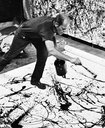
Abstract Expressionism: Jackson Pollock


Creative Process

The creative process- what is this phenomenon that we often hear of as being more important than the actual artifact or end product? Many believe that the process of creating is where true meaning can be found in the synthesis of ideas and feelings. For example, world renowned Jackson Pollock believes in expressing his thoughts rather than illustrating them. The word "express" denotes a sense of personal voicing and he does so through the gestures and movements found in the intricate layers of paint.

Pollock's paintings suggest careful placement of each individual strand- like a painstakingly sewn tapestry. On his very first attempt to paint on glass, he washed off the paint claiming that he lost connection with the painting. Pollock shows us just how important the creative process is to him and his audience: he must maintain connection at all times. Pollock also attributes life to his paintings and allows them to live, suggesting that "there is no beginning and no end". One can develop a greater appreciation for art, music, architecture, automobiles, etc. when the creative process is taken into consideration. Take for example clean water.

We often take for granted the availability of clean water to drink, bathe, and wash with. It takes endless hours of work to create and build water treatments facilities to reach all homes and buildings. Just imagine all the work it takes to create a system that meets the needs of a million people in one city, all while hiding it underground so that it isn't a hazard or visual impairment on the aesthetics of the city. There too lies a creative process in designing a system to provide you with something as simple as the liquid that comes out of your faucet. Whatever the case may be, there is a creative process involved in almost all arenas of life.

As designers, teachers, creators, innovators, whatever we may profess to be, we all wish to create meaning in what we produce and prove it to the world. Why else would we work so hard? So, this "thing" called the creative process- this is where hidden knowledge is revealed.